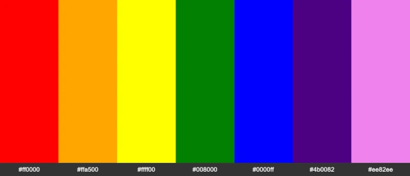
I asked ChatGPT to “explain how colors relate to your brand. what kind of products and offerings are related to different colors?”

Here’s what ChatGPT Said About Colors for Your Brand
Colors play a significant role in shaping a brand’s identity and perception. They convey emotions, messages, and values associated with the brand, influencing how consumers perceive and interact with it. Different colors have different associations, and choosing the right color palette can help create a strong connection between your brand and your target audience. Here’s how various colors relate to products and offerings:
Red: Associated with energy, passion, and excitement, red is commonly used in industries like food and beverages, sports, and entertainment. Brands that want to evoke a sense of urgency, boldness, or stimulate appetite often use red in their branding.
Blue: Blue is associated with trust, stability, and reliability, making it a popular choice for technology, finance, healthcare, and professional services brands. It conveys a sense of calm, security, and professionalism, which is appealing for companies offering services that require consumer trust.
Green: Green is often associated with nature, growth, and sustainability. Brands in the environmental, organic, or health and wellness industries often use green to convey eco-friendliness, freshness, and health. It can also symbolize wealth and luxury, making it suitable for high-end brands or financial services.
Yellow: Yellow represents optimism, happiness, and warmth. It is often used by brands that want to evoke feelings of cheerfulness, creativity, and positivity. It’s a popular choice for food and beverage brands, children’s products, and creative industries.
Orange: A blend of red’s energy and yellow’s warmth, orange is associated with friendliness, enthusiasm, and creativity. It is often used by brands in the technology, entertainment, or food and beverage sectors that want to convey a sense of playfulness, approachability, and innovation.
Purple: Purple symbolizes luxury, sophistication, and mystery. It is frequently used by high-end brands, beauty and fashion products, or artistic and creative industries. It can also evoke a sense of spirituality, making it suitable for wellness or self-improvement brands.
Pink: Pink is often associated with femininity, romance, and softness. It’s a popular choice for beauty, fashion, and childcare brands that target a predominantly female audience or wish to convey a sense of nurturing, compassion, or tenderness.
Brown: Brown represents earthiness, stability, and reliability. Brands in the organic food, outdoor, or craftsmanship industries often use brown to convey a sense of warmth, comfort, and dependability.
Black: Black is associated with sophistication, elegance, and luxury. It’s commonly used in high-end fashion, technology, and automotive industries to convey a sense of exclusivity, power, and class.
White: White symbolizes purity, simplicity, and cleanliness. It is often used by brands in the healthcare, technology, or minimalist design sectors that want to convey a sense of clarity, efficiency, and precision.
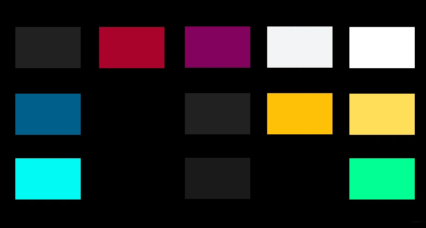
Can You Tell Which Colors I Used for Niche Lightning?

Consider Your Target Audience When Selecting Colors for Your Brand
When selecting colors for your brand, it’s essential to consider your target audience, industry, and brand values. By choosing a color palette that resonates with your audience and communicates your brand’s core values, you can create a strong brand identity that sets you apart from competitors.
Keep Your Color Scheme Simple
Colors can be overwhelming if you are not careful. We tend to want to use bright colors for everything these days in the desire to get as much attention as possible.
Using muted tones, grays and soft colors with brighter accents is usually best. Unless of course you have a high energy brand such as street fashion or something sports related.
Use the 60 – 30 -10 Rule
Three main colors should be used in order to have balance in your color scheme. The major, the minor and the accent.
The 60 – 30 – 10 rule states the major color is used 60% of the time, the minor color is used 30% of the time and the accent 10%.
I include more tips on how to customize your color scheme with the Niche Lightning Theme when you purchase the theme and get access to the Niche Money Creator’s Hub.
See you there!
Related Posts...
Fastest WordPress Plugins for Niche Lightning
Get these wordpress plugins up and running fast, for free, and watch your blog fly past your competition. Autoptimize, Rank Math and Cloudflare.
The Best Blogging Tools for Your Niche Lightning Website
The best tools for your niche lightning blog include: WPEnging wordpress hosting, Aweber email list manager, Cloudflare and NicheMone.co
Access the Niche Money Creator Hub
Access the Niche Money Creator Community with the Niche Lighting Wordpress theme. Includes: Business and Marketing, Coaching & Tutorials.

